
|
dirrtyforeplaydesigns
Aimoo Forum List |
Ticket |
Today |
Member |
Search |
Who's On |
Help |
Sign In |
 |
|

|
| Title: Ratings please | |
| dirrtyforeplaydesigns > Extras > Ratings | Go to subcategory: |
| Author | Content |
|
AshleyAdams
|
|
|
Date Posted:04/09/2011 11:11 AMCopy HTML I've been doing this since '04 or so, however, I haven't really made many in the past couple of years. Mostly because of lack of interest, however there are times when the mood strikes me or one of my close friends requests one. Below are the results of those times and some of my favorites from the past couple of years. Please keep in mind, I make these for proboards use as signatures so a lot of them will be smaller then what would be considered normal for aimoo size. 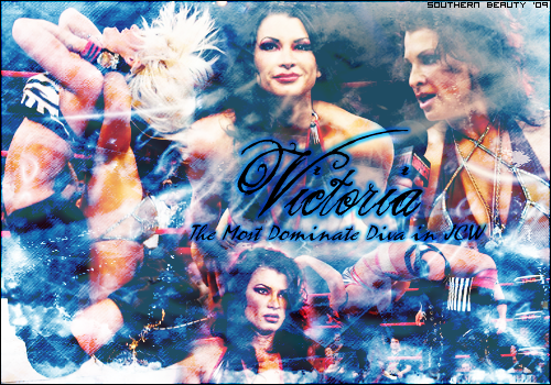 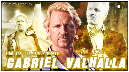 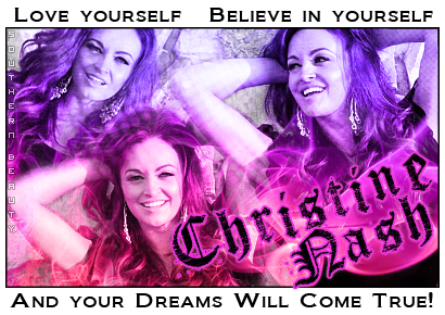 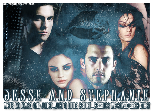 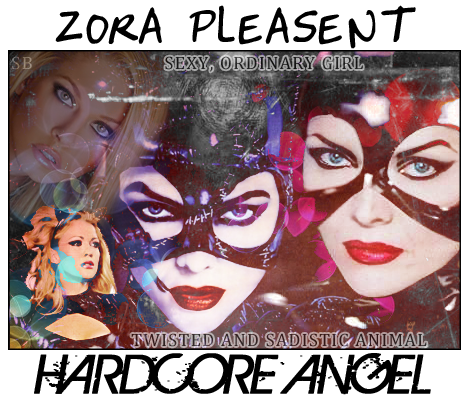 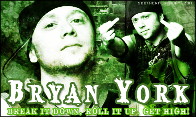 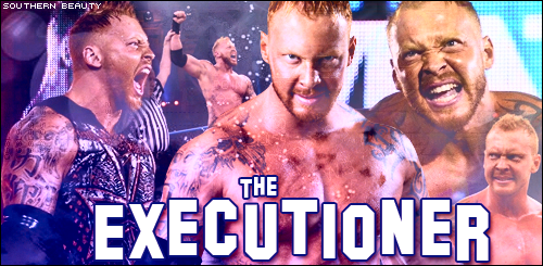  Thanks for all thoughts |
|
nikkirebel
|
Share to:


 #1
#1
|
|
Re:Ratings please Date Posted:08/10/2011 4:59 AMCopy HTML Well hey! I remember you lol :) And for some reason a Matt Hardy banner you did in the past sticks out in my head... Lol
Victoria - 7/10 I like the colour and mostly I like how it's been laid out and the colour, the font placement is good too. However, I don't like the cloudy sort of effect and the font is just... weird. Also, and this might not be you, but it's dominant, not dominate... I'm a spelling and grammar geek, sorry lol. Jeff Jarrett - 6.5/10 Yeah, hard to rate small banners. Cause my first thought is "why isn't it bigger?" but I recall what you said lol. Picture placement is really off for me. And I dunno, if the other two pics are gold, maybe the main picture should be slightly tinged or something? I dunno, looks a bit off. Also the change in font for the slogan is a bit weird. Really love the textures/brushes though. Maria - 7.5/10 I love the colours and the font/font placement. Picture placement is off again for me. I dunno, maybe it's just the size that's throwing me off, but right Maria takes up likehalf then left Maria is in a tiny corner. I love the text effects on the top and bottom with the transparent background! Jesse and Stephanie - 8.5/10 Yum, Milo. Lol. I love the effects - particularly the kiss and skull and crossbones because you reference Romeo and Juliet... The font and placement is amazing. Picture placement could be a bit better, but overall, love it. Zora - 6.5/10 If you're doing a split personality, the banner should be split a lot more because the main focus of the banner for me is the catwoman pictures, then in the corner it's the other girl, so you don't get the effect you should. Not such a fan of the text, but I really like the effects. Bryan - 7/10 I like it a lot, but I reckon there could be more to it. More effects, thicker textures or something. Executioner - 7/10 I like it, though I think I'd take out the pic of him in the ring and move the pics a bit. As above, could do with more effects. Something more could be done with the font too. Christy - 8.5/10 Beautiful. Love this one. Placement on the front pic could be better... Looks like she has the far left head growing out of her head lol. Not a fan of the text either. But everything else is great, textures, colour, effects. |


Copyright © 2000- Aimoo Free Forum All rights reserved.
