
|
dirrtyforeplaydesigns
Aimoo Forum List |
Ticket |
Today |
Member |
Search |
Who's On |
Help |
Sign In |
 |
|

|
| Title: Ratings Por Favor | |
| dirrtyforeplaydesigns > Extras > Ratings | Go to subcategory: |
| Author | Content |
|
Layla_Helmsley
|
|
|
Date Posted:30/06/2011 6:37 AMCopy HTML 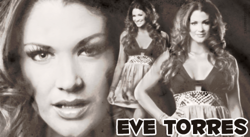 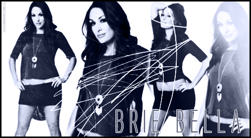 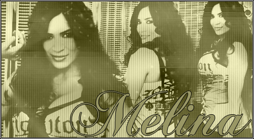 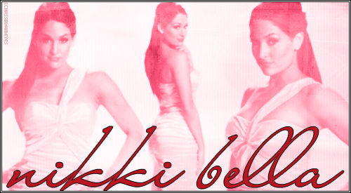 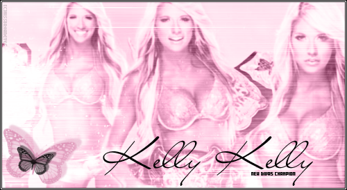 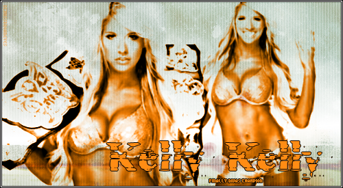 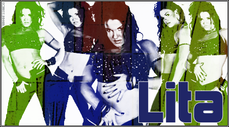 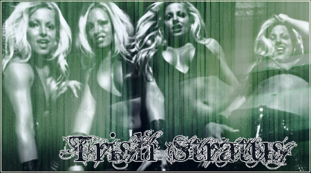  [IMG]http://i663.photobucket.com/albums/uu351/Miss_Brown_Eyes/amanda-1.png[/IMG] [IMG]http://i663.photobucket.com/albums/uu351/Miss_Brown_Eyes/gail.png[/IMG] [IMG]http://i663.photobucket.com/albums/uu351/Miss_Brown_Eyes/clarke.png[/IMG] [IMG]http://i663.photobucket.com/albums/uu351/Miss_Brown_Eyes/layla.png[/IMG] [IMG]http://i663.photobucket.com/albums/uu351/Miss_Brown_Eyes/hsp.png[/IMG] [IMG]http://i663.photobucket.com/albums/uu351/Miss_Brown_Eyes/laycool.png[/IMG] |
|
nikkirebel
|
Share to:


 #1
#1
|
|
Re:Ratings Por Favor Date Posted:05/07/2011 9:11 AMCopy HTML A general comment would have to be don't colour every banner one colour, leave some natural or use lots of different coloured textures over the top. Or greyscale the original banner before putting on textures. Says me, whose banners are pretty much always one colour lol. Also - and this is just personal preference - I like my banners big, so I think these would be better if they were bigger.
Eve - 7.5/10 Would have been nice with some different colours. Even just popping her eyes and the font with a different colour would have been nice. Not sure on the left picture, it's just a tiny bit too big... you don't see the bottom of her chin. The font is a bit hmm too. Brie - 8.5/10 I really like this banner - if Brie was one of my characters, I'd use it. A couple of things wrong - on the rightmost picture she's going white, which doesn't fit with the rest of the banner. And the one next to that, her face is scribbled on, which can work, but IMO doesn't in this one. I'm not too sure about the font. To start with I didn't like it, but I kinda do now lol. Melina - 6.5/10 I don't like the colour. I'm not a fan of the effect, and I think the font should be a different colour lol. Well blended and would probably mark more if it were blue or purple or just any other colour really, lol. Nikki - 8/10 I really really like this banner but the font doesn't go at all. The banner has a soft feel to it then bam here's here name in huge dark writing. Kelly - 8/10 I like the banner, the font is great, the butterfly is great, the placement is a tad off though, like I'm not sure what's happening with the belt between pics two and three. Could also do with another colour. Kelly 2 - 6/10 The orange just makes her look like she's spent too much time putting on fake tan. Not a fan of the effect or the font either. Lita - 7/10 Nice colours, picture placement and font bring it down though. Trish - 8/10 Love this banner, picture placement and font bring it down again though. R-Truth - 7/10 Worst promo cutter ever! He was spouting about doo-doo when I saw him on Saturday. Nice. Any way. You can't really see R-Truth and the kid should be a bit smaller, since R-Truth has three pictures and I reckon is the main focus of the banner. Not a fan of the font either. John Cena - 8/10 I lke the font. Not so sure about the colour or the picture placement. I don't really like the lines either. Gail - 9/10 See, I mark higher for bigger banners, lol. I like everything on this except the font and it's placement. Actually, the font is good, but outline should be different. Maybe drop shadow on it instead. Plus you kinda can't read the slogan. Melina - 8/10 Really purdy banner. I just don't get why part of it is whited out if there is no name there. Layla - 7.5/10 Maybe a bit too heavy with the brushes, woulda been better more opaque. And maybe the name shoulda been all in black? Layla/Kelly - Layly? or Kelya? Ooh, Kelel - 7/10 Don't like the colour or the font. Everything else is great. LayCool - 7/10 Don't like the colour or the font. Everything else is great. |
|
Layla_Helmsley
|
Share to:
#2
|
|
Re:Ratings Por Favor Date Posted:05/07/2011 4:15 PMCopy HTML im really bad with fonts ill hve top download some more. And the MElina one with no text was because they didnt want text on it. I tried to give her text.
Thanks Nikki ill take what you say and see what I can come up with Im always looking to make my designs better |


Copyright © 2000- Aimoo Free Forum All rights reserved.
