dirrtyforeplaydesigns Aimoo Forum List | Ticket | Today | Member | Search | Who's On | Help | Sign In | |
dirrtyforeplaydesigns > Extras > Ratings Go to subcategory:
Author Content
DarkKnightKaze
  • Rank:Bronze Member
  • Score:30
  • Posts:9
  • From:USA
  • Register:10/10/2009 5:34 PM

Date Posted:03/08/2010 8:31 PMCopy HTML
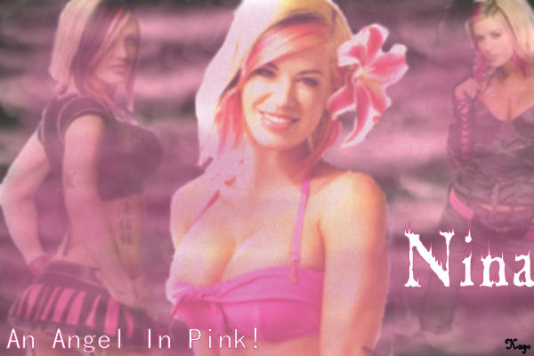


I know the erasing job on them is terrible.  I need to work on that.  I'm mainly asking about everything else.
King_Douchebag Share to: Facebook Twitter MSN linkedin google yahoo #1
  • Rank:Diamond Member
  • Score:864
  • Posts:354
  • From:USA
  • Register:03/12/2009 12:56 AM

Re:More to rate

Date Posted:07/08/2010 8:43 PMCopy HTML

Overall:  Maybe you should switch to clone brush rather than erasing.  Depending on what program you use.  And trying different textures would not be a bad idea.

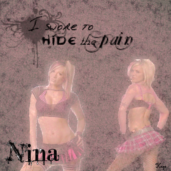
Nina 1:  Your texture is too heavy.  Fonts don't really work.  Color could be a lot brighter or cleaner.  Placement of the pictures is really good tho. 

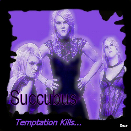
Succubus:  Picture frames have a place, however, it isn't on this banner.  The placement isn't as good as the first.  Color's flat.  The black is too harsh on that barely there purple.  Font doesn't play well with the rest of the banner.

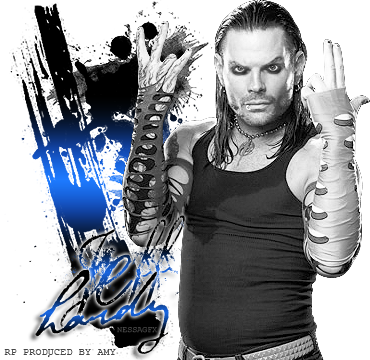
Nina 2:  WAY too big.  Texture doesn't match.  The little inkblot is a nice touch, but you could have layered it on top of one of the pictures and saved all that negative space at the top.  Color is once again washed out.

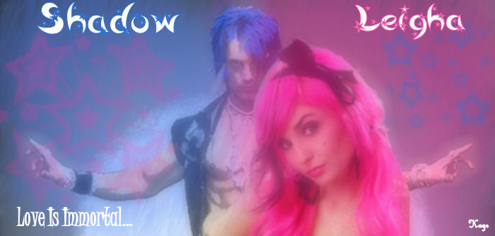
Shadow:  Really cutsey, and I'm not sure if that's what you were going for.  Yes I know, couples banners tend to be cutsey, but this one just seems kinda, wrong.  Washed out in some places, popping in others.  Popping is good, but not with the uber blasae background.  And I probably wouldn't have stacked the pictures right on top of each other, it provides all this negative space that you choose to fill with stars.  I like the slogan font on this one.  It fits what you're saying.  But the names, are again, a miss.

Don't throw them in the trash though, learn from them.  Use the pictures natural backgrounds to your benefit, they take up the negative space and eliminate the choppy eraser lines.  Keep trying.

nikkirebel Share to: Facebook Twitter MSN linkedin google yahoo #2
  • Rank:Diamond Member
  • Score:3649
  • Posts:1364
  • From:Australia
  • Register:09/02/2009 1:49 PM

Re:More to rate

Date Posted:10/08/2010 12:28 PMCopy HTML

I agree with Kat.

Overall - I think you need to invest in some new fonts (check out the top 100 at dafont.com) and some new textures and brushes (deviantart). Nice colours and the placement and texture aren't too bad.

Nina - I don't know if you used the soften effect or something similar but she's all smudged looking and you really can't tell it's Ashley in the leftmost picture. The text placement is off, particularly for her name.

Succubus - The picture placement is off, she should be at the same height all along the banner. And it's a bit plain, sure it's purple, but it's plain, it could do with a texture. Also the border thing is so 5 years ago. I don't like it.

Nina 2 - You shouldn't erase the background on the picture, if you wanted to, you should get a PSD, it's much cleaner (even I don't manage to erase backgrounds cleanly and I've been doing this for years). I do like the paint splotch at the top, however the top is really empty so you could maybe have cut the top part off and done that at the bottom.

Shadow and Leigha - I like this one, I totally get what you were going for, the blue with pink stars on one side and vice versa on the other side. Totally cute for a couples banner. However the picture placement is a little bit weird.

But practise makes perfect, so keep at it =)

Copyright © 2000- Aimoo Free Forum All rights reserved.