
|
dirrtyforeplaydesigns
Aimoo Forum List |
Ticket |
Today |
Member |
Search |
Who's On |
Help |
Sign In |
 |
|

|
| Title: Gonna get some ratings | |
| dirrtyforeplaydesigns > Extras > Ratings | Go to subcategory: |
| Author | Content |
|
KayleeAdams
|
|
|
Date Posted:05/11/2010 6:43 AMCopy HTML OKay here we go these are all requests or sigs made for challanges
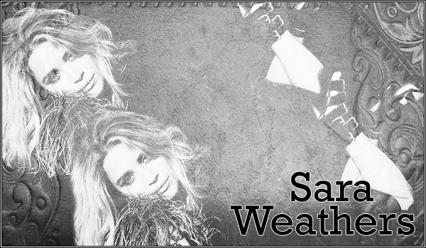 the requester wanted a preppy type look I think I did okay with this one  he wanted a grungy feel to it 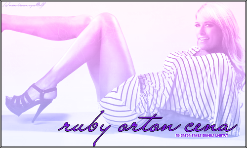 This one wanted an innocent feel to it 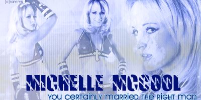 this was for a say something nice challange. Basically you have to say something nice about a diva you hate  |
|
King_Douchebag
|
Share to:


 #1
#1
|
|
Re:Gonna get some ratings Date Posted:05/11/2010 8:28 PMCopy HTML sara: i honestly think this could have been okay with just one pic rather than two. but i do really like the texture. maybe just a splash of color on it would have been helpful.
matt: texture is great, not sure about the name font. the color is a little "sexually questionable".. ruby: i really like this one. majorly. i don't have anything that i could say against this one at all. michelle: nice slogan. no body can make her look good in my eyes. it's not possible. but from a technical aspect, the only thing i can say is in the close up pic, her head looks huge.  |
|
KayleeAdams
|
Share to:
#2
|
|
Re:Gonna get some ratings Date Posted:05/11/2010 8:50 PMCopy HTML lol for the Matt Ward banner he wanted the background to be purple and white.
Thanks for the input |
|
JohnCena11
|
Share to:
#3
|
|
Re:Gonna get some ratings Date Posted:06/11/2010 2:14 AMCopy HTML Sara: The black and white could have used a little color.
Matt Ward(Me): I wanted to changed things up color wise because im sick and tired of the same colors for banners i use. i am going to be bias and i love the banner. ROC: that is simply Amazing Michelle Mccool: The Most Overated Champion on Raw and Smakdown that every one loves to HATE including me. but graphics wise the sigg is good with the color choices, but like Kat said the front right side of the side the head look enlarged. |


Copyright © 2000- Aimoo Free Forum All rights reserved.
