
|
dirrtyforeplaydesigns
Aimoo Forum List |
Ticket |
Today |
Member |
Search |
Who's On |
Help |
Sign In |
 |
|

|
| Title: And another | |
| dirrtyforeplaydesigns > Extras > Ratings | Go to subcategory: |
| Author | Content |
|
DarkKnightKaze
|
|
|
Date Posted:31/08/2010 9:59 AMCopy HTML 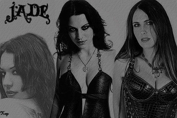 |
|
LadyAshley
|
Share to:


 #1
#1
|
|
Re:And another Date Posted:31/08/2010 9:03 PMCopy HTML I hadda do this xD since i have used Cristina myself for years!
it's actually not bad. Does look a little grainy. I don't know if you meant to use a whole different picture on purpose but the picture on the right isn't Cristina. I know this, i have a photobucket dedicated to her from collecting over the years. And you can tell right off the bad it isn't. And it ruins from the other two you have of Cristina. Font wise, you might want to outline it with white or something so it will pop out. And as a suggestion, find some textures and play around. Also don't be afriad of using brushes too. Lastly, your signature, it's hard to read and disturbs the banner. Try something smaller like pixel font that you can find on dafont. Smaller the better because it doesn't take from the banner |
|
DarkKnightKaze
|
Share to:
#2
|
|
Re:And another Date Posted:01/09/2010 6:59 AMCopy HTML Yeah I wasn't paying enough attention when I put those pictures on. The other girl is actually from Within Temptation. I didn't do it on purpose but the character dresses like both of them so I figured I would keep it.
|
|
LadyAshley
|
Share to:
#3
|
|
Re:And another Date Posted:01/09/2010 7:18 AMCopy HTML just saying it kinda takes from the banner since there is only one name on it. Like you forgot a name or something. Makes the banner confusing in that sense
|


Copyright © 2000- Aimoo Free Forum All rights reserved.
